buttonMaker.lua
All starter kits/packages come with the module file easy/buttonMaker.lua.
This is a very basic button creating library that allows you to, predefine buttons, then use those 'presets' to make:
- Push Buttons - A button, where an action is taken when you release the button.
- Toggle Button - Similar to a Push button, but the state (on/off) of the button toggles.
- Radio - Similar to a Toggle Button, but only one radio button in a group may be toggled. Toggling one radio button detoggles the rest.
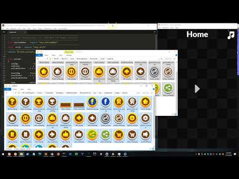
Using Button Maker
This video demonstrates how fast an easy it is to make snazy looking buttons with the preset concept and the buttonMaker module.
Basic Usage
local buttonMaker = require "easy.buttonMaker"
version()
Prints out and returns the current version of the buttonMaker module in the format YYMMDD.
addPreset( name, def )
Adds a new preset definion def to the prests library.
See
easyPushbelow for a full list of preset fields and their purpose.
local default =
{
   selImg           = "easy/fillW.png",
   selColor         = { 0.5, 0.5, 0.5 },
   selLabelColor    = { 0.125, 0.125, 0.125 },

   unselImg         = "easy/fillW.png",
   unselColor       = { 0.25, 0.25, 0.25 },
   unselLabelColor  = { 1, 1, 1 },

   font             = native.systemFont,
   fontSize         = 32,
   labelOffset      = { 0, 0 },
}

buttonMaker.addPreset( "default", default )
getPreset( name )
Returns the definition of a named preset. This is handy if you want to use an existing preset to create a new one. Just get the existing one and modify the parameters you want to change.
local default = buttonMaker.getPreset( "default" )

default.font     = native.systemFontBold
default.fontSize = 40

buttonMaker.addPreset( "big_default", default )
easyPush( params )
Makes a preset based push button using a table of optional parameters.
With the exception of parent, preset, x, y, labelText, and listener, all of the following fields are also valid preset fields.
Passing these fields in your params table will override any preset field the requested preset may have set.
- parent (
display.currentStage) - Group to place button in. - preset (
"default") - Preset to make button based on. - x (
0) - x-position of button. - y (
0) - y-position of button. - width (
preset.widthor200) - Width of the button. - height (
preset.heightor60) - Height of the button. - labelText (
"") - Text to print (if any). - labelOffset (
preset.labelOffsetor{0,0}) - x/y offset of button label. - font (
preset.fontornative.systemFontBold) - Label font. - fontSize (
preset.fontSizeor32) - Label font size. - unselLabelColor (
preset.unselLabelColoror{0,0,0}) - Label color when button is not selected. - selLabelColor (
preset.selLabelColoror{0,0,0}) - Label color when button is not selected. - listener (
nil) - A function to call when the button is released, using this signature:
local function onPush( self, event )
   -- Do something here
end
Examples
Play Button
local onPlay = function( self, event )
   composer.gotoScene( "scenes.play", { time = 500, effect = "crossFade" } )
end

buttonMaker.easyPush( { preset = "play", x = centerX, y = centerY,
                        listener = onPlay } )
Restore IAP Button
local function restoreIAP()
   _G.easyIAP.restore()
end

buttonMaker.easyPush( { labelText = "Restore IAP", fontSize = 22,
                        x = left + 80, y = bottom - 140,
                        width = 140, height = 60,
                        listener = restoreIAP } )
easyToggle( params )
Makes a preset based toggle button using a table of optional parameters.
Takes same parameters as easyPush()
The returned button object has a toggle function that can be used to toggle the button ON. Calling this does NOT call the listener. It only sets the 'toggled' state of the button to true.
easyRadio( params )
Makes a preset based radio button using a table of optional parameters.
Takes same parameters as easyPush()
The returned button object has a toggle function that can be used to toggle the button ON. Calling this does NOT call the listener. It only sets the 'toggled' state of the button to true.
 Copyright © Roaming Gamer, LLC. 2008-2018; All Rights Reserved